I recently went through an exercise that had the following prompt: Take one of your favorite photos and create ten variations of it. The first couple will be easy. Convert to B&W, negative, etc. However, after that, you’ll have to get creative and maybe step out of your creative comfort zone to find different ways to interpret the image. Try to do the work only in Lightroom and Photoshop (or whatever your favorite processing software is) to help you get more familiar with what creative tools are available.
I had some questions – like how much difference there should be between versions. Is adding an Orton effect enough to be considered a different version? So I asked for the podcast that inspired the assignment and what I got from that was that the more differences between versions, the more I’d get out of the exercise. The podcast used examples like “turn it into a negative image”, “flip it 90 degrees”, “change focus”, “extreme lighting differences, i.e. dodging and burning”, etc. “The purpose of this exercise is to get you out of your comfort zone and trying new things because staying ‘in your groove’ if you will is the antithesis of the creative life.” (From "Here's a Thought" #992 with LensWork editor Brooks Jensen)
I had some questions – like how much difference there should be between versions. Is adding an Orton effect enough to be considered a different version? So I asked for the podcast that inspired the assignment and what I got from that was that the more differences between versions, the more I’d get out of the exercise. The podcast used examples like “turn it into a negative image”, “flip it 90 degrees”, “change focus”, “extreme lighting differences, i.e. dodging and burning”, etc. “The purpose of this exercise is to get you out of your comfort zone and trying new things because staying ‘in your groove’ if you will is the antithesis of the creative life.” (From "Here's a Thought" #992 with LensWork editor Brooks Jensen)
Scroll through this album to see the twelve variations I came up with. (Yes, I did more than ten because I was having so much fun with it!) I'm not suggesting that all of them are good, but they definitely got me thinking differently which was the whole point of the exercise.
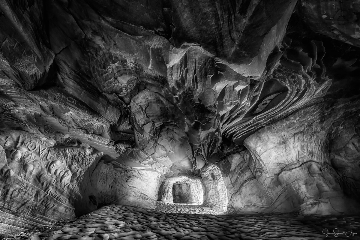
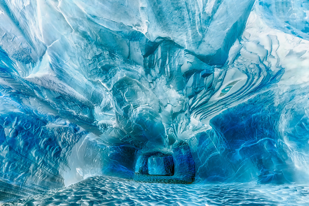
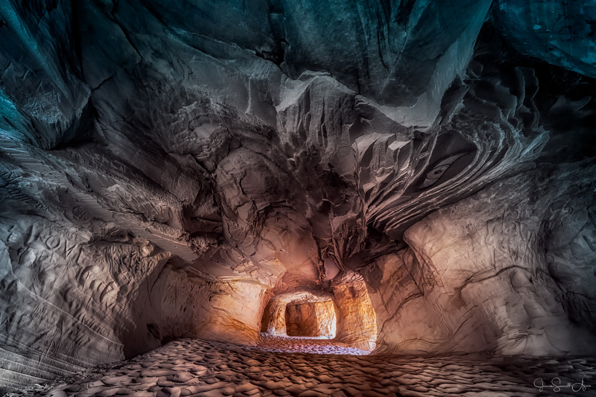
After thinking about it for a bit, I decided to use this photo (titled "Inner Turmoil") for the exercise because:
1. It’s one of my better photos and I love it.
2. It’s almost abstract as it is, so I felt like it would be easier to manipulate and come up with other variations that I actually liked. (That said, maybe I should try this with a most literal landscape photo and see if I still enjoy the process. ;-)
3. It has a limited color palette, so again, I felt like it would be easier to handle the colors.
Extreme lighting changes
This is actually the last variation I worked on because I thought it would be the most challenging for me. And it was. But I've put it first in the sequence because I think it's interesting to compare it to the original version.
Technical details:
I found it difficult to dissociate my brain from the original version that I spent many hours staring at as I worked on it. So I used a few "tricks" to get me to a starting point that looked completely unfamiliar to me.
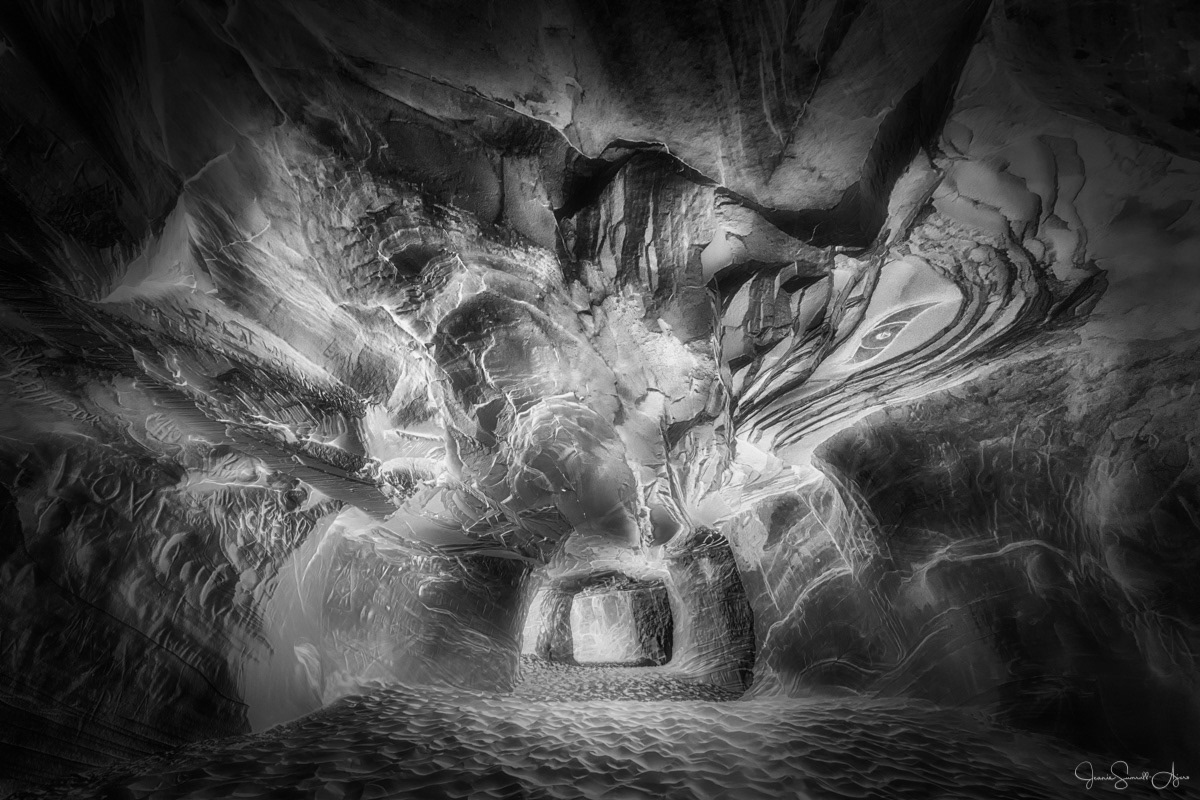
1. I started with the Color version and created a B&W variation that had very little contrast, i.e. it was all middle-tone grays.
2. I inverted the image to turn it into a negative which essentially reversed the lighting direction.
3. I rotated the image 180 degrees to work on it upside down.
4. This became my starting point to start dodging & burning to add contrast little by little to bring out details.
5. I debated as to whether I wanted to keep the image "upside down", but when I tried rotating it back 180 degrees, I really liked it and decided that was it.
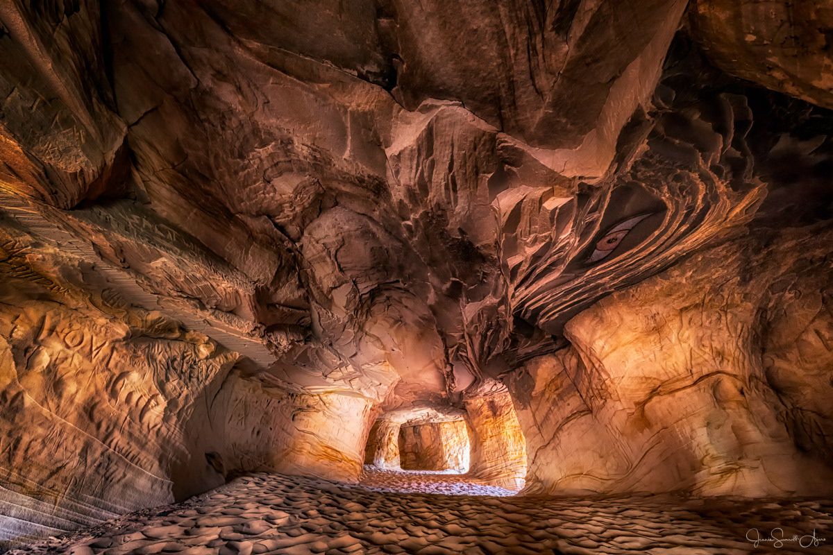
Color
This variation was essentially a gimme since this color version was created before the B&W, i.e. I already had it in my catalog. I included it because I felt that the color could be useful in some of my variations.
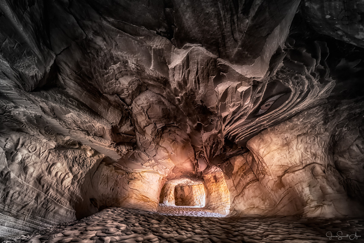
Color/B&W blend
Technical details:
1. Layer the color version over the B&W version in Photoshop.
2. Change the blend mode of the color version to "Color" to use the tonal values of the B&W version.
3. Add a mask with a radial gradient to blend from color inside the cave to B&W at the edges.
Negative
Technical details:
I simply inverted the color version in Photoshop. (Ctrl/Cmd-I)
Color blend
(I don't personally like this as much as the Color/B&W blend, but the technique might work better on a different photo.)
Technical details:
1. Start with the Color/B&W blend.
2. Layer the Inverse version as the top layer in Photoshop.
3. Change the blend mode of the Inverse to "Color" and add a mask with a radial gradient to affect just the outer edges.
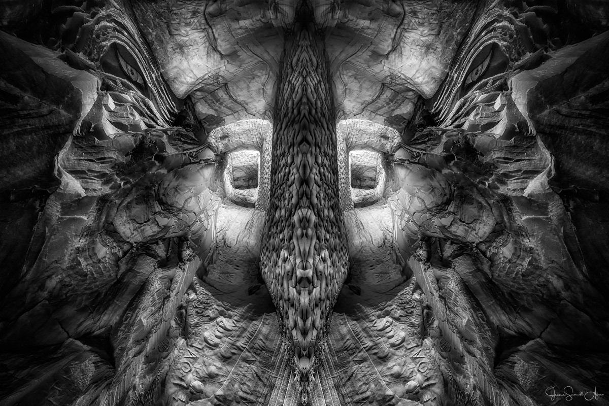
Rotate & mirror
This variation blew my mind. What do you see?!
Technical details:
1. I rotated the original B&W 90 degrees and then mirrored it.
2. I immediately saw a face of some kind, so to enhance that effect, I cropped to make it look like a portrait and used the Warp tool in Photoshop to narrow the bridge of the "nose".
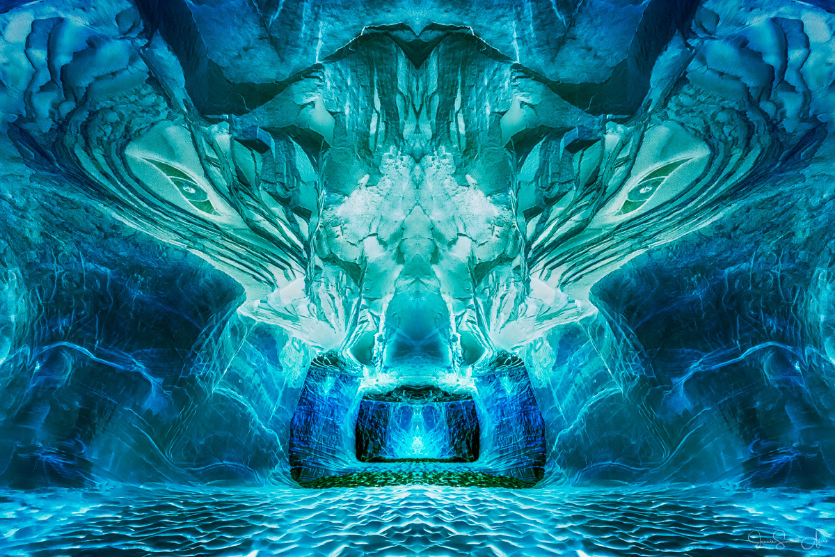
Mirror image (based on the Negative variation)
Technical details:
1. I cropped the Negative variation in the middle of the cave opening and then mirrored it.
2. I darkened the edges.
3. I added a bit more green to the blues in the area above the cave to provide more variation in the color.
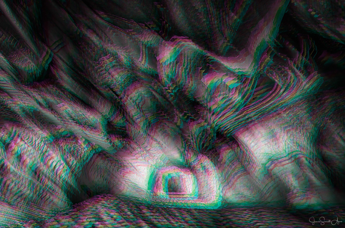
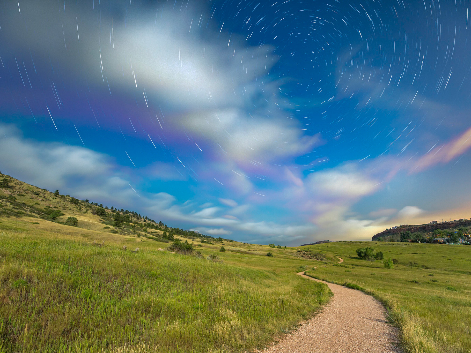
Harris Shutter Effect
I apologize for making your eyes go buggy! Feel free to scroll past quickly. ;-)
Technical details:
1. This is a technique that I first learned about in a photo challenge that I participate in. You can read more about it here.
2. This technique is usually used in a scene where most of the scene is static and with movement in one part of the scene, for example a landscape with clouds moving in the sky. Obviously I already have the photo of a static scene, so I tried to create the movement by making three layers of the B&W image in Photoshop and then moving two of the layers into different positions.
3. I then chose to combine one channel from each of those layers into a new document. (See the link above for step-by-step tutorials.) This resulted in the effect you see here - which is not exactly pleasant to look at.
It just occurred to me that I might have been able to selectively choose some of the areas with the rainbow hues and masked them in over the original B&W. I'm not sure that would make it more palatable, but it might.
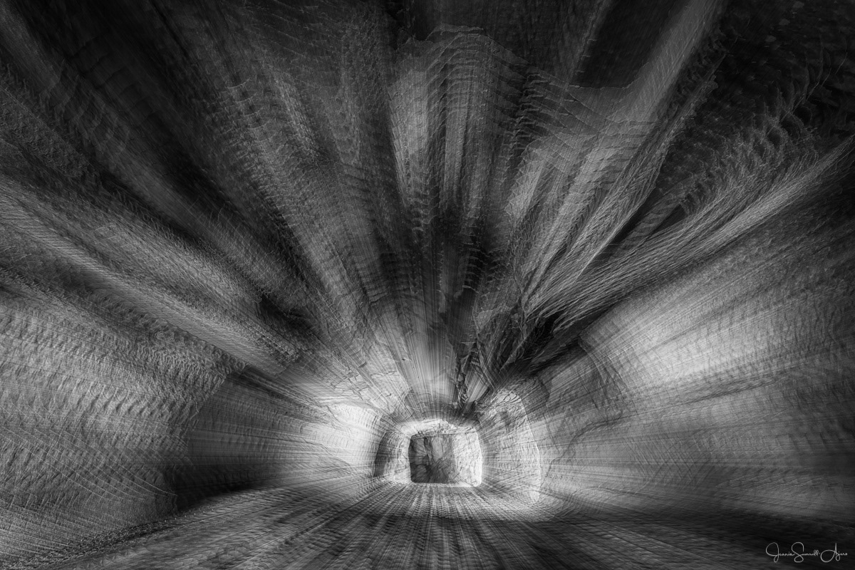
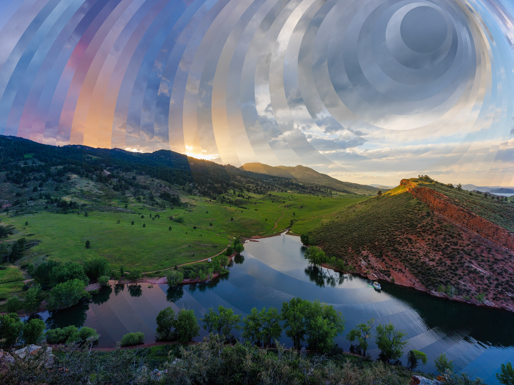
Zoom effect
Technical details:
1. This was one of my attempts with the Harris Shutter Effect where I changed the position of the layers by making each layer slightly larger than the one below it. It reminded me of a zoom effect created by moving the zoom ring during a long exposure (aka Intentional Camera Movement), but I didn't like the rainbow colors to I desaturated it.
2. To further add to the zoom effect, I created an "exploding" texture by making a new layer in Photoshop, filing it with noise and then running the Radial Blur filter multiple times and changing the blend mode to Overlay.
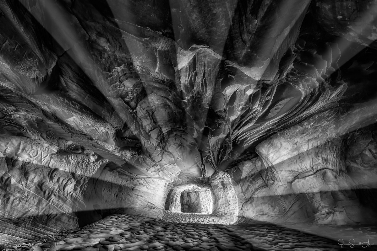
Light rays
Technical details:
This variation was a bit of an iterative process. I'll leave out the steps that I ended up not using. ;-)
1. I started with the original B&W.
2. I made a new layer in Photoshop and created a B&W starburst effect (following this technique).
3. I selected the white areas and deleted them.
4. I added an Bevel & Emboss layer effect.
5. I changed the blend mode to Lighten.
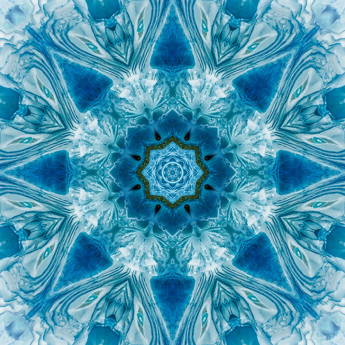
Kaleidoscope
This is the only version I did outside of Photoshop using some software that I developed many years ago. (It is no longer available.) I could have done it in PS, but the software was much easier. I created two kaleidoscopes using the Negative variation of the photo and blended them in Photoshop using masks because I liked the center of one version better than the other.
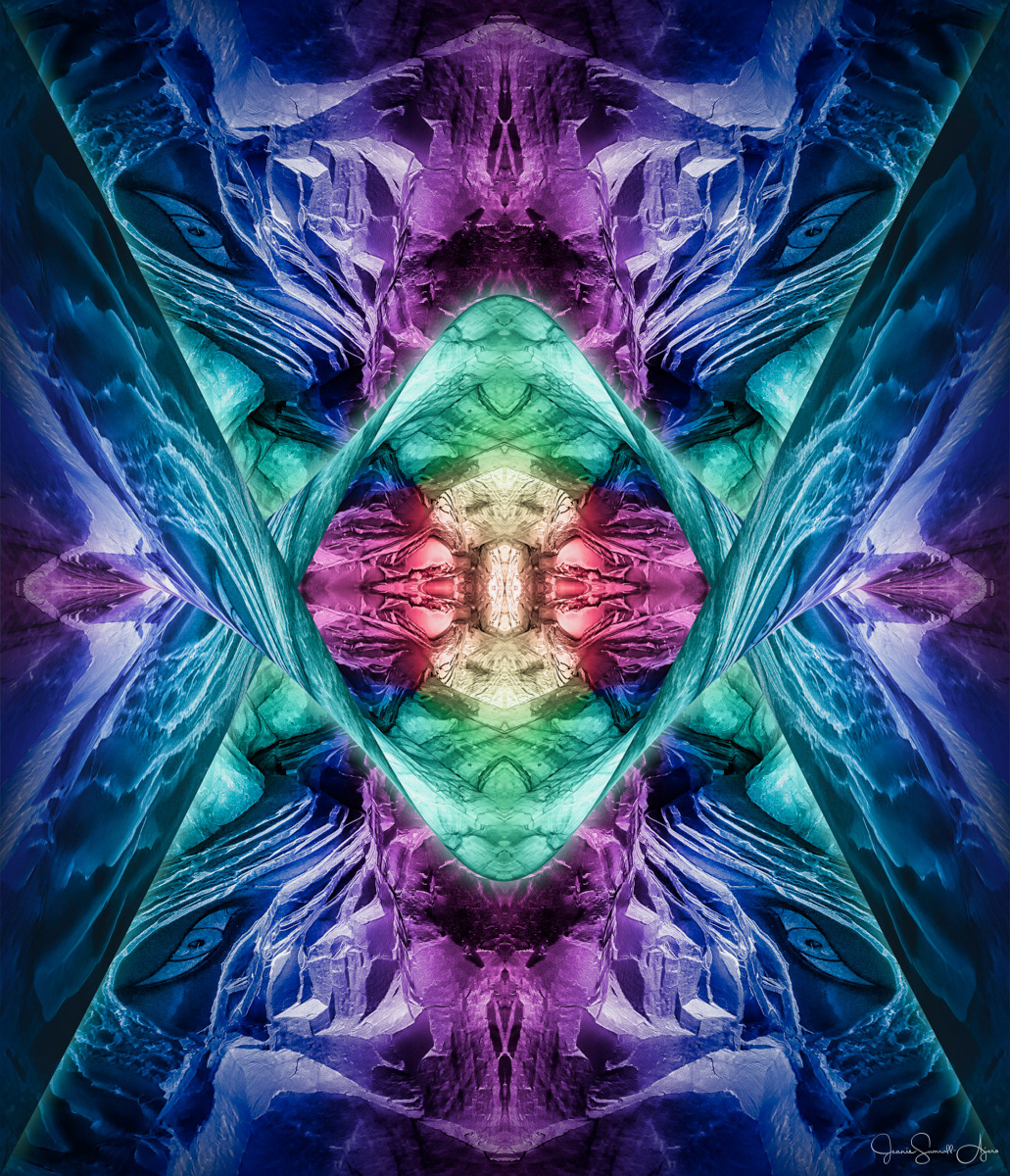
Creative play
I went down the rabbit hole with this one, so I can't easily describe my process. Let's just say that it involved starting with the original B&W in Photoshop, a rainbow gradient using the Angle Gradient option, Color blend mode, cropping, mirroring, warping and layer effects.